How I designed and launched the #1 mindfulness/astrology app for iPhone
The CHANI App
Consumer mobile app | ShippedUX, UI, and content design as well as PM and PMM work for the #1 astrology/mindfulness appOVERVIEW
I was the founding product designer/manager (employee #3) for the CHANI app, the #1 iOS astrology/wellness app for iPhone.
CHANI aimed to outshine other astrology apps with an intuitive interface, high-quality content, regular updates, and a subscription model.
Our v1 launch was a big success, reaching the Apple App Store's top 10 on our launch day. Within the first few months, we had over 500,000+ downloads, a 4.9/5 rating, 10,000+ positive reviews, over 10x revenue growth, job creation, Apple App of the Day recognition, and widespread media coverage.
“The app's design is thoughtful, detailed, and a constant treasure trove of insights. The artwork and the app's flow are fun and user-friendly.”
“The app is so smooth, so user-friendly and intuitive, pun intended ha ha... So simple... I really can't ask for a better experience.”
UNDERSTANDING OUR AUDIENCE
As an influencer with a substantial online following, Chani brought in an established subscriber base. We conducted research, both quantitative and qualitative, to understand the preferences and requirements of our existing customers. This guided us in developing user personas tailored to our target audience, primarily millennials who followed Chani on Instagram. Additionally, we aimed to cater to long-time astrology enthusiasts, including older individuals who might be less tech-savvy, while also extending our reach to Gen Z.
CREATIVE DIRECTION
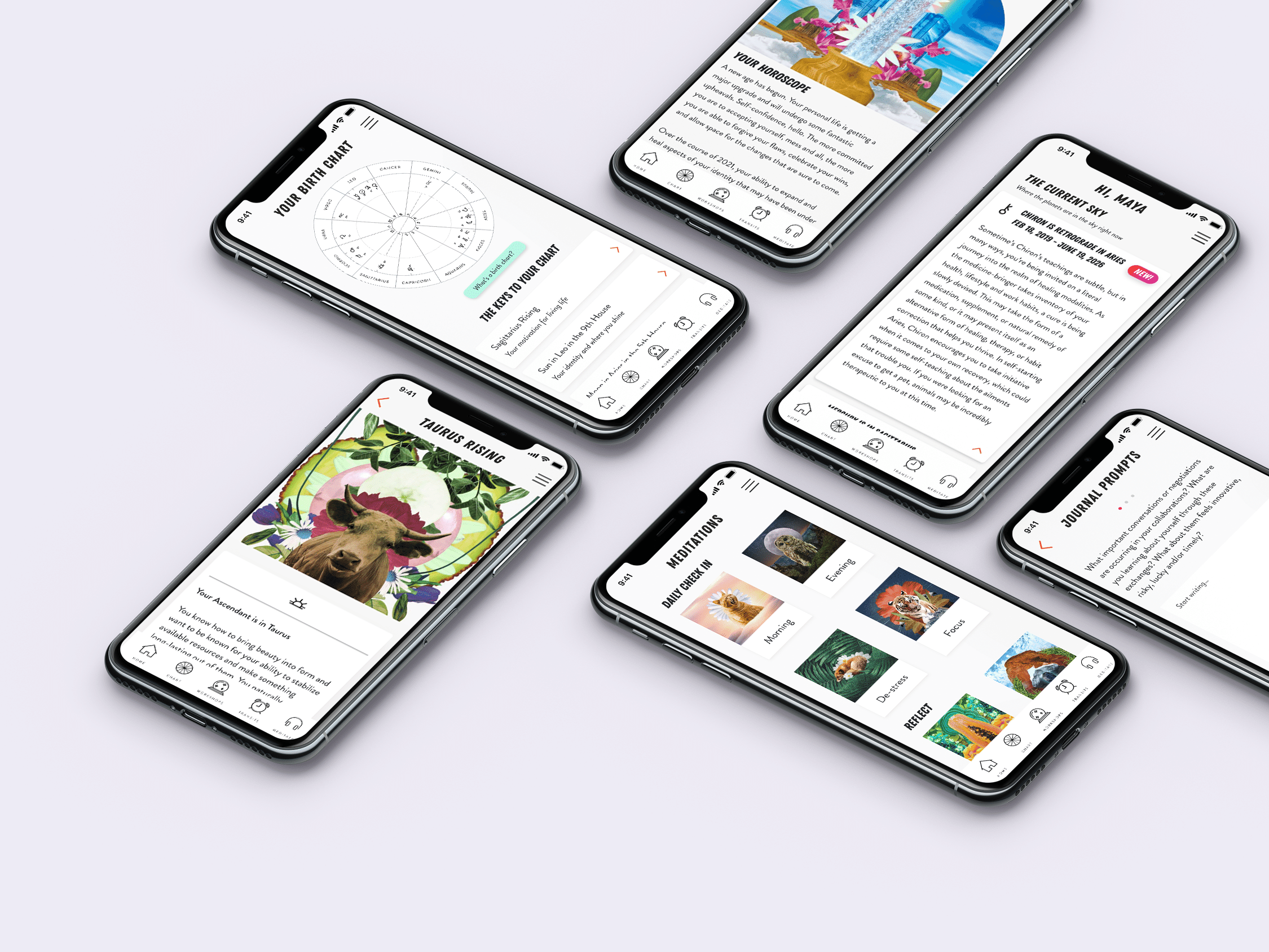
To match the founder's creative vision, the app's illustrations incorporated traditional elements like animals, plants, metals, herbs, and colors associated with the wisdom tradition. I developed a style guide using typefaces, colors, and illustrations consistent with the founder's identity, setting us apart from competitors.
The design focused on readability, with clean, minimal aesthetics for user-friendly text consumption. We used a bold decorative typeface for headings (H1/H2) and a sans-serif for body text. Content cards with drop shadows were used to segment information for learning. Light pastels and neutrals served as backgrounds, while brighter colors were reserved for icons and action buttons to avoid overwhelming users.
FEATURES & FUNCTIONALITIES
Here are the 5 main app features:
1. Homepage: We anchored the homepage with a weekly horoscope and other content related to the week ahead astrology to engage users. This feature is free and encourages user interaction, often shared on social media.
2. Birth Chart Reading: The app offers a traditional birth chart, with placements as interactive buttons leading to unique readings. Basic information is free, while full readings are behind a paywall. Advanced users appreciate the motion interactions and color-coded aspects.
3. Weekly Workshops: Weekly workshops provide premium content and justify the app's subscription cost. A lower subscription price proved successful. Engagement with the journal was a retention indicator.
4. Transits: This feature, for premium subscribers, offers real-time mini-horoscopes comparing the user's birth chart to the current moment, often shared on social media for its precision.
5. Meditations: The app includes a dedicated feature for audio meditations, with a basic view available to all users. Paywall access is required for guided meditations, which have garnered popularity and celebrity endorsements.

OUTCOMES
Quantitative: Achieved MAU and financial goals upon launch! Huge increase in MRR. 60-70% subscription retention of our launch cohort in Dec-July 2021.
Brand: The launch was amazing - Lizzo shared the app to her Story and tons of people were screenshotting their horoscopes and sharing on social. Top 10 on Apple Free Apps list upon launch. App of the Day, twice. Covered in Vanity Fair, New York Times, and many more.
Users: 10k+ positive reviews of the app, 4.9-star rating in the App Store, people feeling very seen and held by it.


